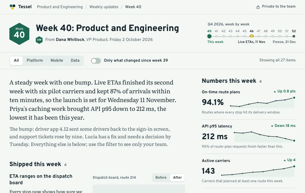
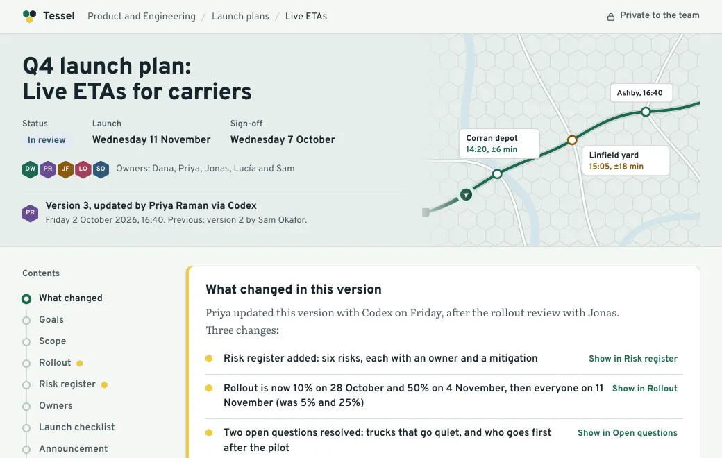
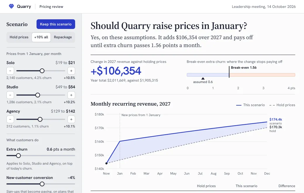
Four questions inside one request
“Turn this CSV into a dashboard” hides four separate questions:
- What data do I need? One export with clear column names, one row per sale or per day, and the date it was taken.
- What do I tell the agent? Which numbers to lead with and which filters to offer, and that every chart and total must follow them. There’s a brief to copy below.
- How do I know it’s right? Compare two totals with a spreadsheet. It takes two minutes.
- How does it stay current? You publish new data to the same artifact each week. The link never changes, but nothing updates by itself.
What readers do with it
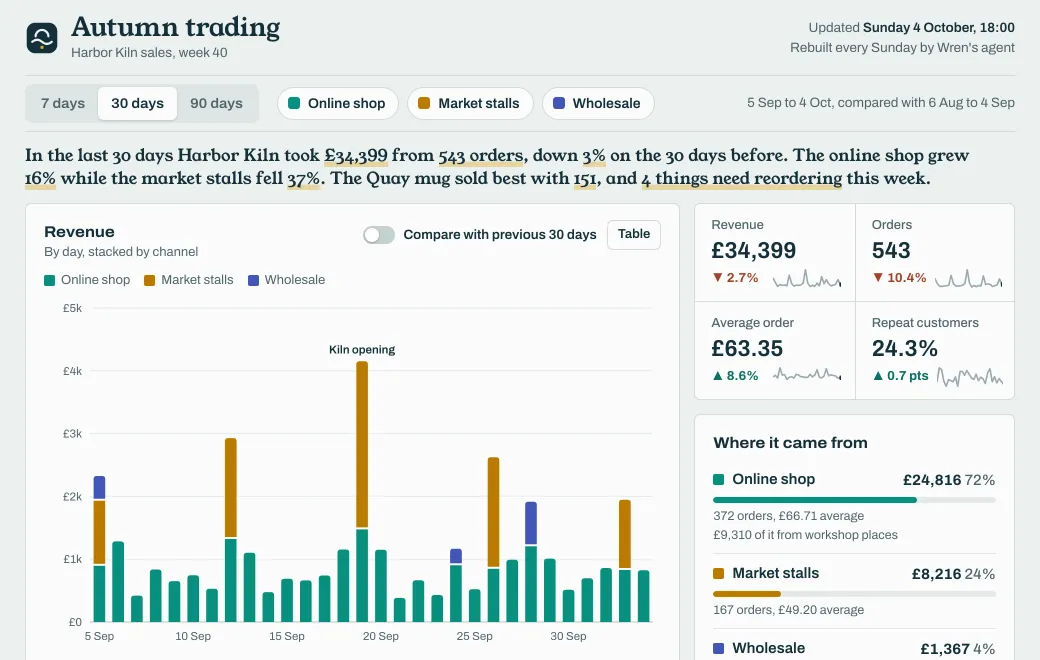
An agent built the dashboard below for Harbor Kiln, a pottery studio, from one week’s sales export. Switch it to 90 days or hide Market stalls, and every number updates.
Each control answers a question a reader would otherwise send you:
- 7 days, 30 days and 90 days set the range, and the four key figures compare it with the period before.
- Online shop, Market stalls and Wholesale filter everything at once. The page won’t switch off the last one; it says “Keep at least one channel on.”
- Compare with previous 30 days draws the earlier period behind the bars. Table shows the same numbers as rows, for anyone who wants to copy them.
- Select a piece under Bestselling pieces, and the running-total chart follows it, split by glaze and by channel.
- Switching off Online shop hides the workshop heatmap, because workshop places are booked there. Turn the online shop back on restores it.
- The sentence above the charts rewrites itself for every combination, so a reader can quote it in a reply.
What they see on a phone
People often open a Monday link on their phone. Below 900 pixels wide, Harbor Kiln’s panels stack in one column and the four key figures move to the top, two by two on a phone. The bestsellers table drops its Share column. There’s no hover on a touch screen, so tapping a column of the chart shows its values. Ask for all of this in the brief.
Start with the data
Use an export with clear column names and one row per sale, like this:
date,channel,piece,glaze,qty,revenue_gbp
2026-09-28,Online shop,Quay mug,Tidepool,3,84
2026-09-28,Market stalls,Rockpool bowl,Ember,1,34
2026-09-29,Wholesale,Side plate,Fog,12,144
2026-09-29,Online shop,Mooring bud vase,Kelp,2,60
2026-09-30,Online shop,Wheel taster (workshop),,2,110
Tell the agent what each column means and what it includes. Here, the online shop also sells workshop places, which have no glaze, and wholesale rows are at trade price. Give the date of the export and ask for it on the page. Harbor Kiln’s page says “Updated Sunday 4 October, 18:00”. Its footer says the figures come from the online shop, the market card reader and wholesale invoices.
A brief to copy
Paste this with the CSV, and change the names to yours:
Build a one-page sales dashboard from the attached CSV, as a single self-contained HTML file with the data inside.

- Lead with four numbers: revenue, orders, average order and repeat customers, each with the change against the previous period of the same length.
- Filters: a 7, 30 or 90-day range, and one toggle per channel. Every chart, table and total must follow them.
- A revenue chart stacked by channel, with values on hover and on tap, a switch to compare with the previous period, and a button that shows the same numbers as a table.
- A sortable table of bestselling pieces. Under it, one line that adds the parts up to the revenue shown, so readers can check it.
- Label every control. At 390 pixels wide, stack the panels and put the four numbers first.
- Show the export date at the top and where the figures come from at the bottom.
- Before you publish, compute total revenue for the last 30 days, and for the online shop alone, from the CSV, and tell me both.
Check the numbers before you share
Ask the agent for two totals from the CSV, then compare them with a spreadsheet and the page:
| Check | How |
|---|---|
| The headline total | Sum the revenue column for the same dates. It should match Revenue on the page. |
| One filter | Filter the spreadsheet to one channel, then leave only that channel on in the page. |
| Chart against totals | Turn on Table. The rows should add up to the headline. |
| The parts | The line under the bestsellers adds pieces and workshop places up to the revenue in view. It should match too. |
| The previous period | Switch on the comparison and check one earlier day against the spreadsheet. |
A common mistake is a total that ignores a filter. Two of these checks catch it, and they take two minutes.
Publish and share
- Publish privately
“Publish the dashboard to artifact.guru in the Reporting project.” It starts Private, which in a team workspace means the whole team.
- Open it on your phone
Check the stacked layout and tap a column before anyone else does.
- Share outside the team if needed
Choose Share and invite an investor or an accountant by Email, or add a Secret code. Invitations aren’t emailed for you, so send the link yourself.
An invitee signs in with the address you invited, using a one-time code that’s emailed to them. If they’re new, they get an account in the same step, without a password or a plan. On a code link, the server checks the code before it sends any of the page.
Refresh it every week at the same link
Next week, give the agent the new export and say exactly what may change:
- “Replace the data in the autumn trading dashboard with this export, update the date at the top, and don’t change the layout. Keep the same link.”
The change becomes a new version at the same link. People see it the next time they open it; a tab that’s already open doesn’t update by itself. Nothing is scheduled, either. The “Rebuilt every Sunday by Wren’s agent” line on Harbor Kiln’s page means someone at the studio asks the agent each week.
If a week’s numbers come out wrong, open Versions and choose Roll back on last week’s. That version is live at once, and the newer one is kept. More on how versions work.
See who opened it
Open the artifact and switch from Versions to Views. It covers the last 30 days.
| Link | What Views shows |
|---|---|
| Every link | Views, daily visitors, where they came from, countries and devices |
| Private or Email | Also who opened it, by name, how often and when |
Link previews and prefetches aren’t counted, and neither are your own workspace’s opens of a public or code link while signed in. If Views shows the team opening it every Monday, the refresh is worth keeping up. Only the app shows views; your agent can’t read them. More on what Views records.
A snapshot, not a live connection
artifact.guru doesn’t connect to your shop, your accounts or your database. The dashboard holds the data you published, and it’s as current as its last version. In return, nothing a reader clicks is sent anywhere, and the numbers can’t change under them in the middle of a meeting.
When a BI tool is the better choice
- The data has to be live, or refresh on a schedule without anyone asking.
- Different viewers should see different rows, such as each region only its own.
- The data is bigger than a page. A single HTML page is up to 5 MB, data included.
- Readers build their own charts and save their own views.
- An analyst needs to trace every number back to a query.
A published page suits a weekly view that a small team reads in a minute on any device, without each reader needing a seat.
Limits
- What readers change (filters, a selected row, Mark as reordered) isn’t saved. A reload starts fresh, and each reader’s clicks are their own.
- There are no comments on the page. Feedback comes back by email or chat.
- Views counts opens. There’s no time on page or scroll depth, and nobody is notified when someone opens the link.
- Pages run in a sandbox with no server behind them.