People ask the next question themselves
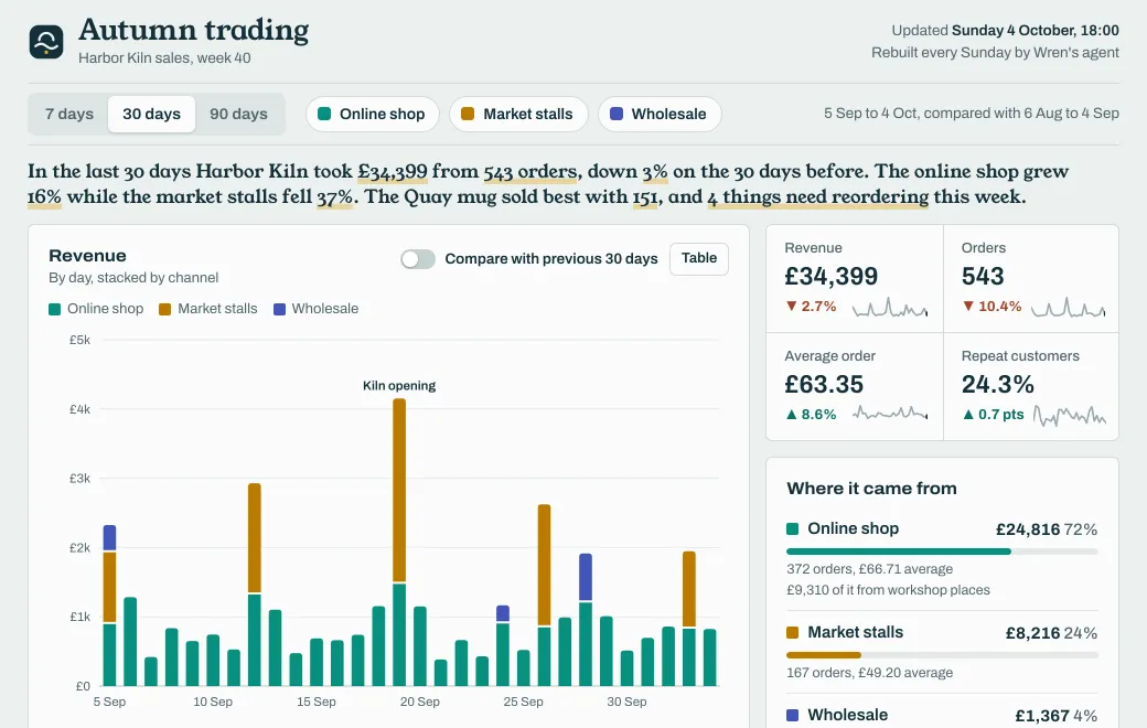
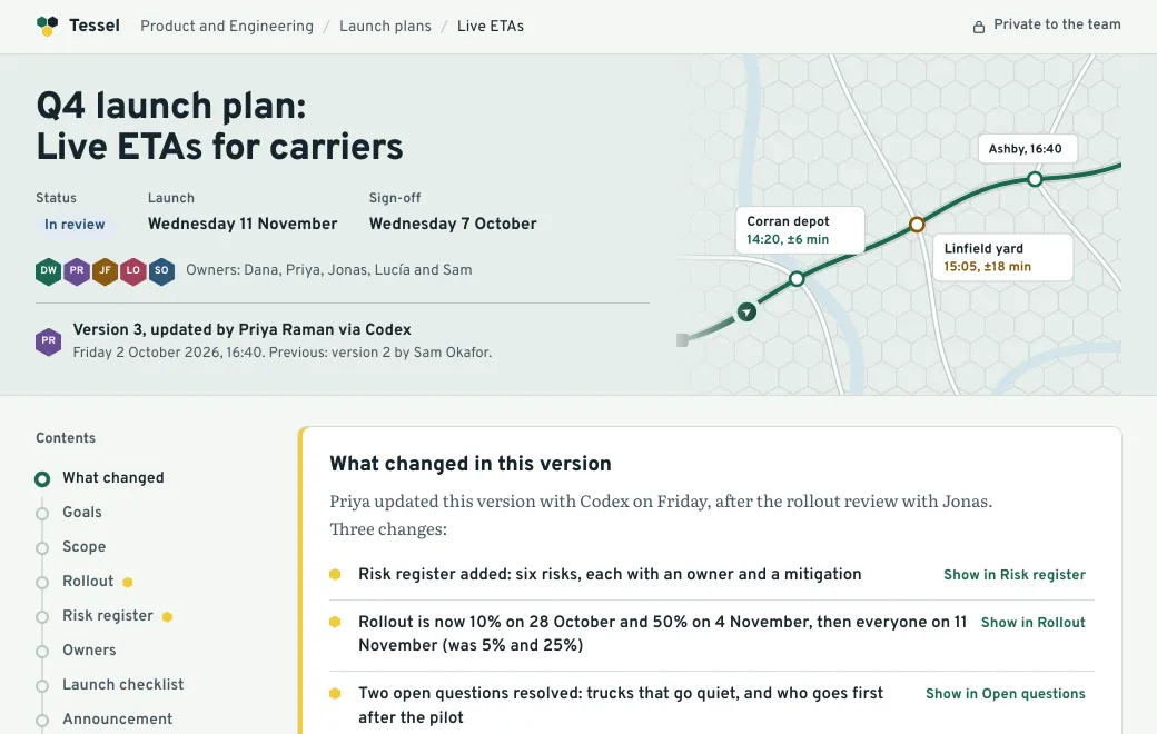
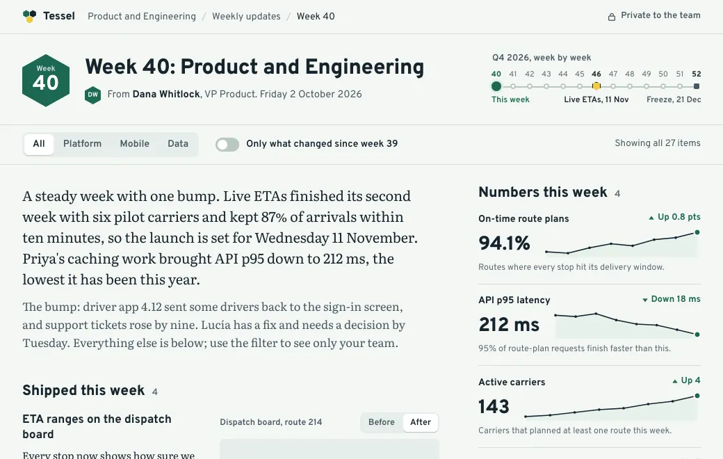
A screenshot answers the question you thought of. With working filters, each reader can answer their own, like how wholesale did over the last 90 days. When every number follows the filters, nobody has to ask you to re-cut the data.
An agent built the Harbor Kiln dashboard above from a sales export, and at its artifact.guru link the controls still work. Change the date range or the channel, and every chart and total updates.
A weekly dashboard in four steps
- Start from approved data
Give the agent the export and say what each column means. Ask it to embed the data in one HTML page, with the date of the export on it.
- Check the totals
Ask the agent for the expected totals for two or three filters, and compare them with the page before you share.
- Publish privately
In a team workspace, Private already means the whole team. You can also invite an investor or an accountant to just this artifact by email.
- Refresh by publishing again
Next week: “replace the data in the autumn trading dashboard with this export”. The link stays the same, and last week’s version stays in the history.
What makes a dashboard worth opening
| Do | Because |
|---|---|
| Put the four numbers that matter first | Readers who stop there still get the point |
| Show the change against the last period | A number without a comparison means little |
| Let one filter drive everything | Totals that disagree with the chart destroy trust |
| Say when the data is from | Readers need to know how fresh it is |
| Add one thing to do | A reorder or follow-up list gives people a reason to come back |
Limits
- Each version is a snapshot of the data it was published with. It doesn’t connect to your database or BI tool.
- Filters and sorting run in the reader’s browser. Nothing they click is sent anywhere.
- Pages can load chart libraries from a public CDN, or draw charts themselves as the Harbor Kiln dashboard does.